The visual identity refresh has afforded the opportunity to extend the font family to ensure consistency across mediums.
These particular fonts were all chosen as the best representation of type that brings together the academic and technical sides of our brand, while capturing a warm, humanistic tone in our communications that aligns well with the people-centric focus of the Institute strategic plan.
Typefaces for Print
DIN
This commercial type family was chosen for its dependability and origins in urban signage and engineering. It is extremely flexible, and available in multiple weights, including a Narrow variation in all weights.
Free Web Alternate: Roboto and Roboto Slab are widely available on most operating systems.
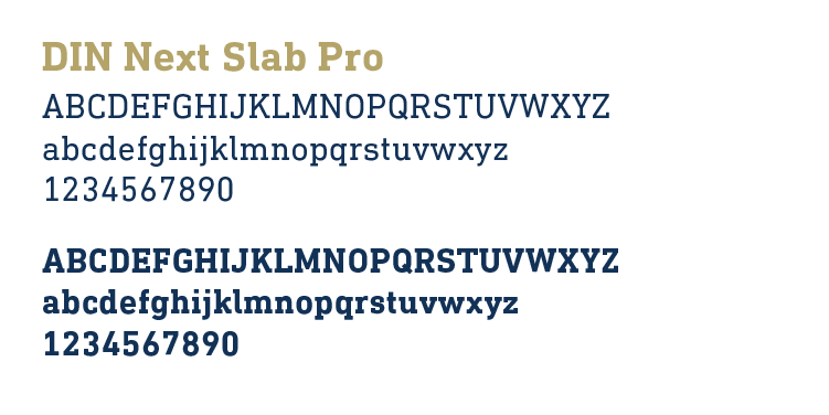
Used for: Logotypes and headlines primarily.
To use it, you must purchase a software license. Download DIN Next Slab at MyFonts
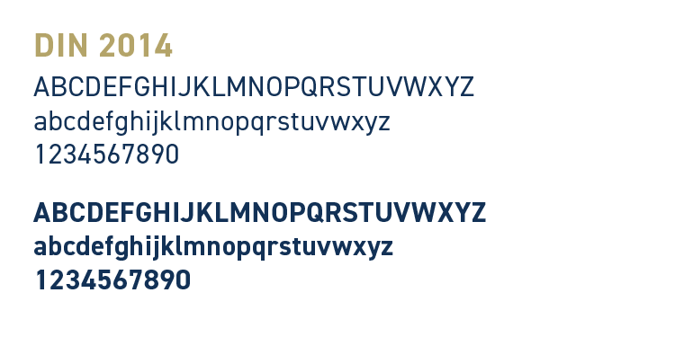
Used for: Headlines, taglines, and small blocks of copy in various weights.
Available through Adobe Fonts at no additional charge if you have a Creative Cloud subscription. They are also available for purchase: Download DIN 2014.
Adelle
Adelle is a modern slab serif that bridges the divide between tradition and modernity. This serif typeface and its companion sans serif typeface Adelle Sans serve as the secondary typefaces for use in designed materials.
Free Web Alternate: IBM Plex Serif and IBM Plex Sans are open source typefaces available on most operating systems.
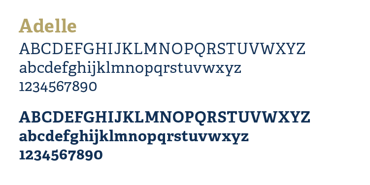
Used for: Subheads, sidebars, and small blocks of copy.
Pair with: DIN 2014 when applicable.
Available through Adobe Fonts at no additional charge if you have a Creative Cloud subscription. Also available for purchase: Download Adelle.
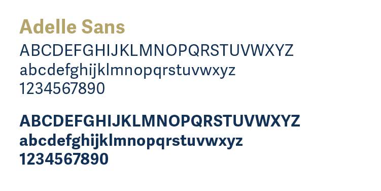
Used for: Subheads, sidebars, and small blocks of copy.
Pair with: DIN Next Slab when applicable.
Available through Adobe Fonts at no additional charge if you have a Creative Cloud subscription. Also available for purchase: Download Adelle Sans.
Source Serif 4
An open source serif typeface.
Free web alternate: Georgia is widely available on most operating systems.
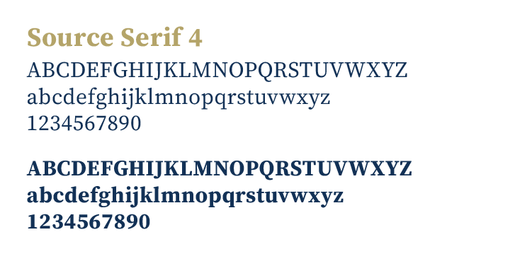
Used for: Primary body copy for most printed Institute publications.
Available for free from Google Fonts: Source Serif 4
Typefaces for Digital Media
Roboto
This sans serif font was developed by Google and is the primary alternative typeface for Georgia Tech websites and applications.
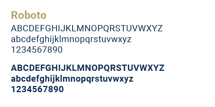
Used for: All digital text other than header elements.
Available for free from Google Fonts: Download Roboto
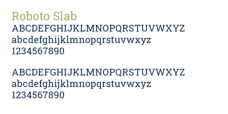
Used for: Subheadings and pullquotes.
Available for free from Google Fonts: Download Roboto Slab
Typefaces for Email and Everyday Documents
The Institute does not have official guidelines for which typography to use for these applications.
When you create a new blank document in Microsoft Office, any text you type appears in the default font, Aptos.