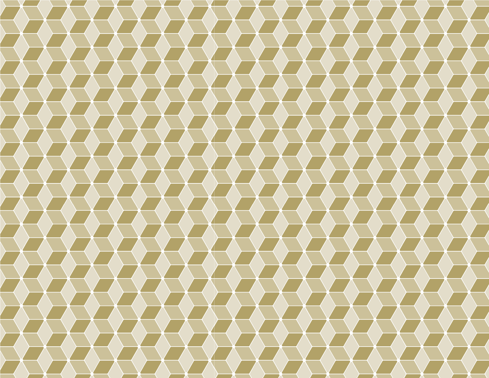
Georgia Tech’s diversity and innovation are expressed through our brand’s shapes and patterns. These elements can be used to complement or frame designs, lead the eye through content, and reinforce the branded look and feel of graphic communications without detracting from the message.
The shapes and patterns leverage our primary and tertiary color palettes and allude to the hexagonical nature of the hive.
Shapes
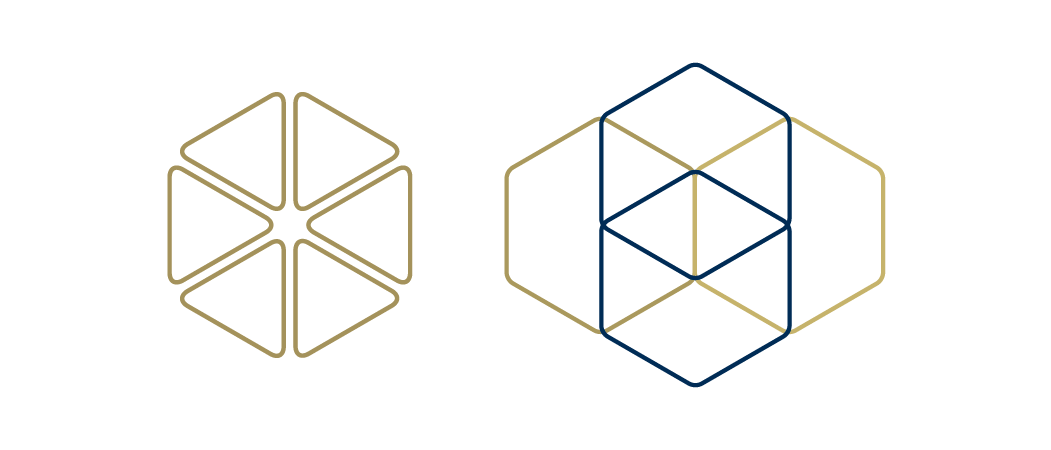
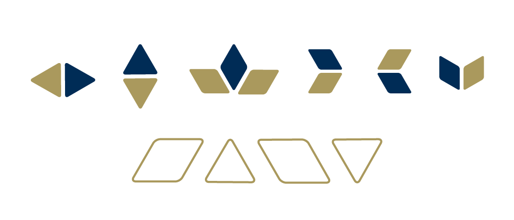
The hexagons and mosaic tile shapes are dynamic elements, meant to inspire creators across campus. Each tile is derived from a segment of the hexagon and may be added to print communications and digital designs to add visual interest and direct the reader.
They should be used sparingly, so as not to overwhelm the viewer. Color combinations are encouraged, as long as they do not dominate the design or detract from the primary brand colors.
Hexagons
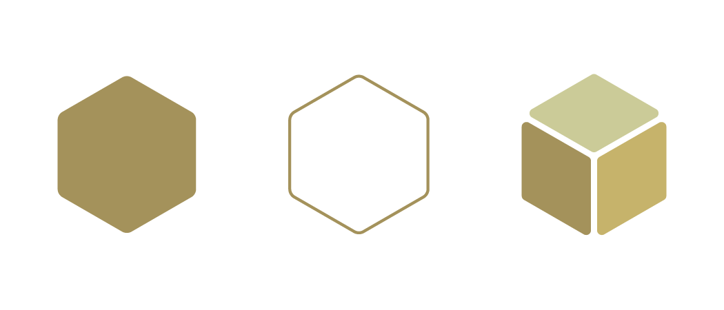
The hexagon is the primary visual shape of the Georgia Tech brand. It can be used in solid and outlined form (in totality or cropped), as a visual element, or to frame photography or other assets.
Mosaic Tiles
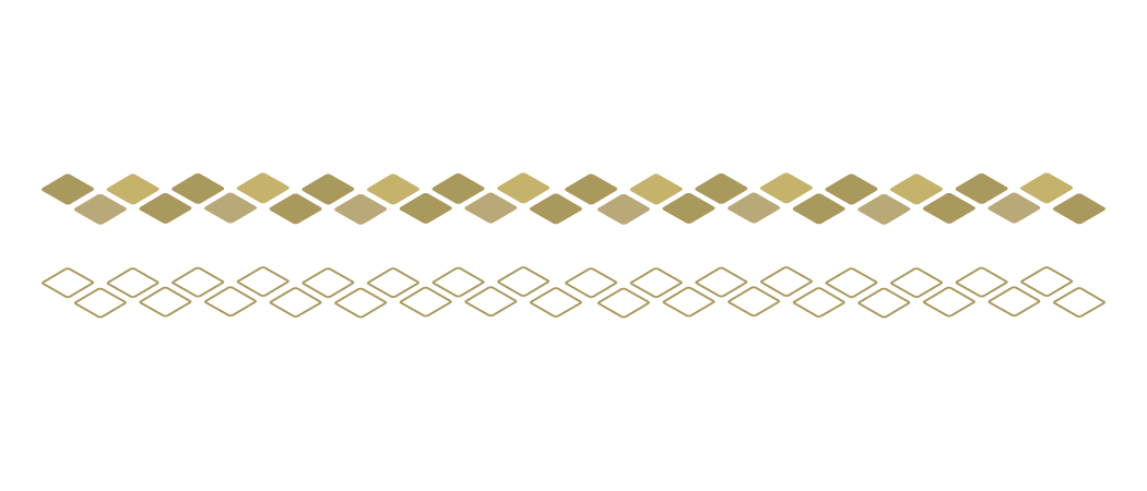
These shapes can be used individually or in an arrangement with other tiles to create patterns, lines, and dynamic collages.
Patterns
Hive
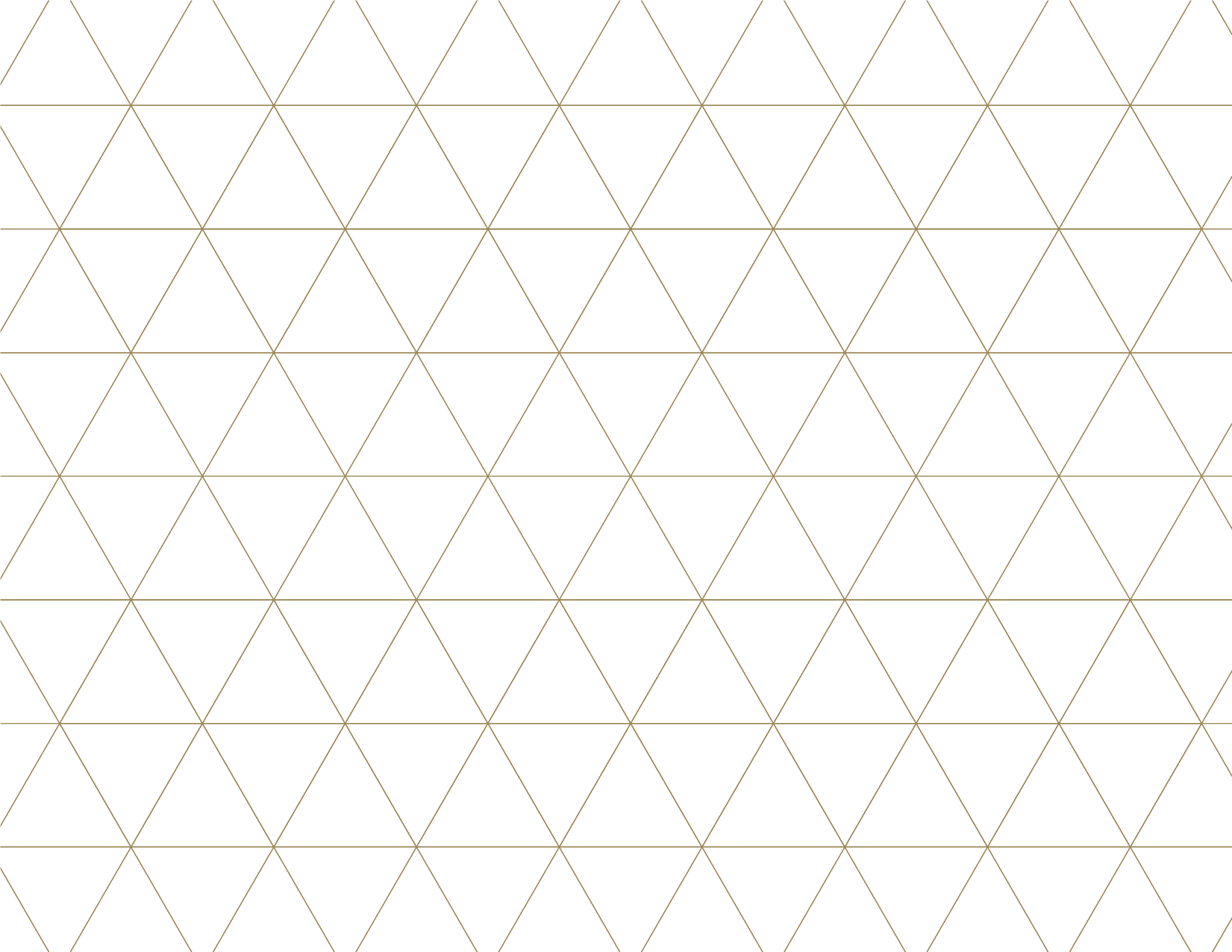
The new hive pattern mirrors the mosaic tiles to create a grid reminiscent of a yellow jacket hive.
Dot Matrix
The dot matrix pattern evokes the technical nature of our students' work and provides a lighter texture for use in designs.

Pinstripes
The pinstripe pattern features stripes with a 30° slant in either direction.

Mosaic
Mosaic
A tiled companion to the mosaic design elements, this pattern adds visual interest to any design piece.
